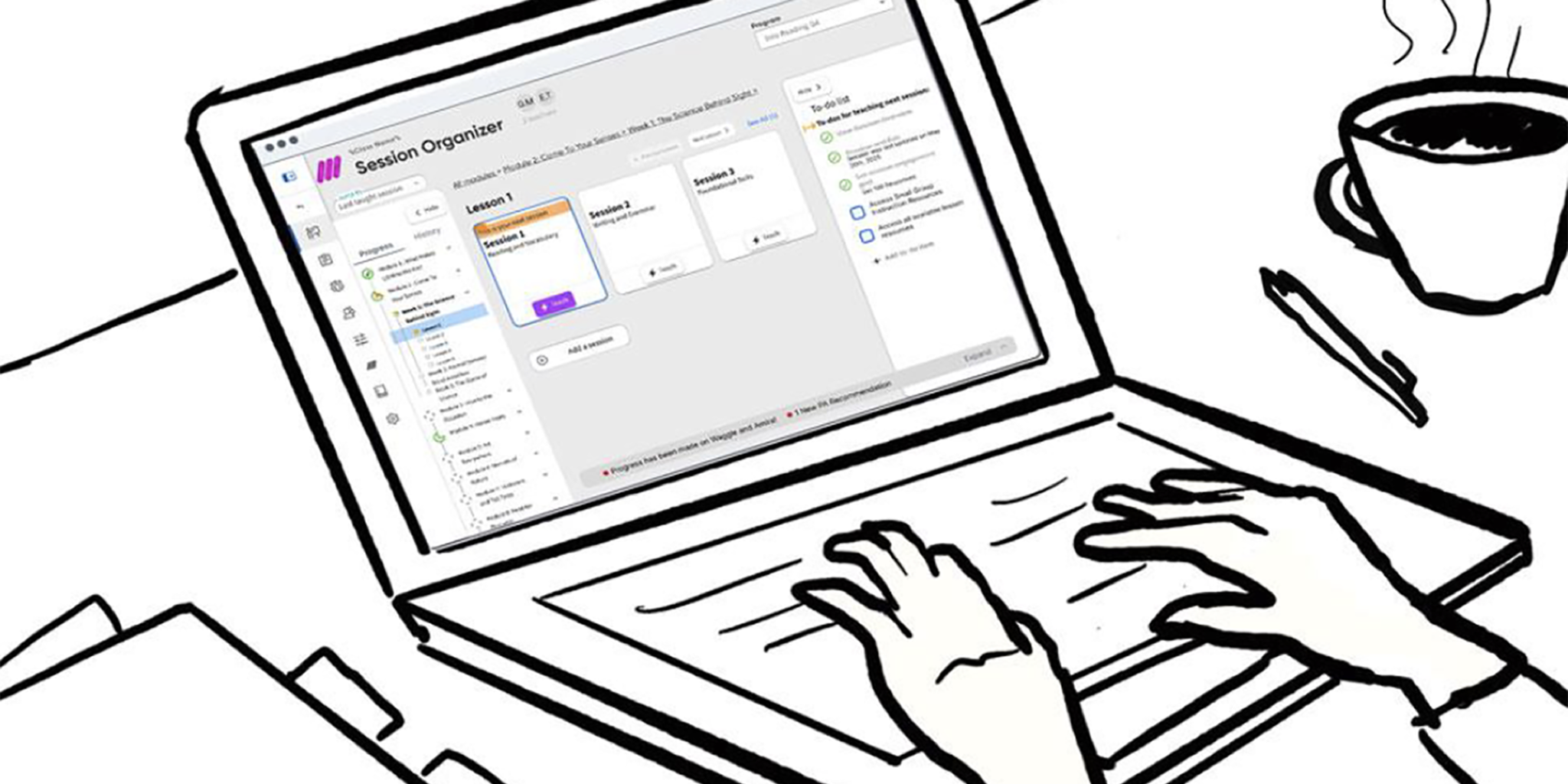
An Unorganized Organizer
Our existing Session Organizer looked to have everything teacher’s needed in one place: lesson materials, supplemental resources, planning tools, you name it. The reality was that we were just dumping all of that into teachers’ laps expecting them to sort it out for themselves. While that kind of “flexibility” might be okay for an experienced teacher, new teachers needed better scaffolds to help them through their day-to-day. With the v2 experience we needed to design for both.
Understanding the Problem Space
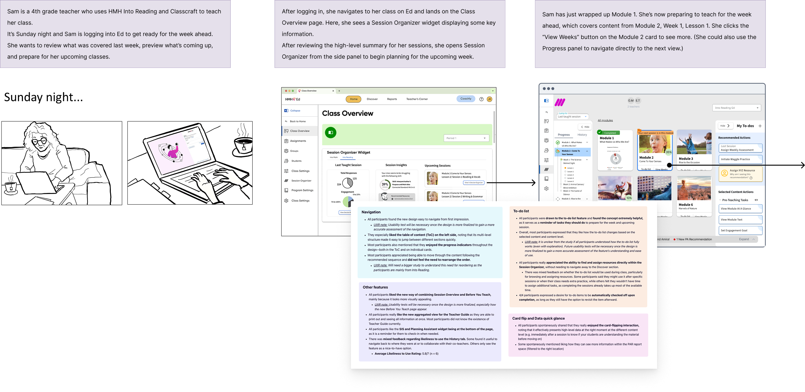
Before touching a wireframe we invested a week in Montreal to gather a small in-person team to explore the problem space from the ground up. That meant fully diving into our teachers’ daily reality – the before-school planning, the in-the-moment teaching, the after-hours grading and lesson adjustments, and the moments where our platform fit into a broader ecosystem of tools that they were already using. We ran affinity mapping sessions to cluster themes from research, we storyboarded user journeys to stress-test early assumptions, and we pressure-tested feature ideas from rapid ideation sessions with on the fly interviews with actual teachers. We didn’t leave Montreal with a finished design but we did leave with a focused, agreed-upon set of requirements and a shared mental model that drove who and what we were designing for and why.

List of Content → List of Actions
One of the central insights from our research was a shift in how we understood the product’s job. The v1 experience was organized around content: here’s everything that exists, now go find what you need. We realized that what most teachers, especially new teachers, actually wanted was something organized around actions: here’s what to do, in what order, right now.
At the same time, experienced teachers frequently wanted the flexibility to break away from that step-by-step script, customizing their own sequence based off of their expertise and instincts as a teacher. That dual need became our framework that guided the architecture of this new experience: not a checklist OR a flexible resource bucket, but both, coexisting in the same interface.
Zones of Focus
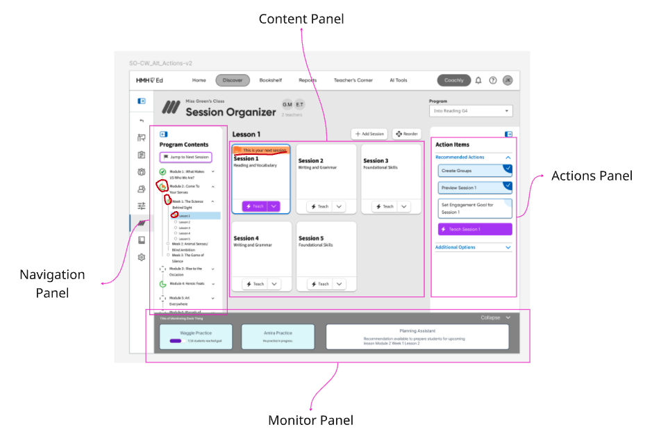
The first priority was to reclaim the interface from its own accidental complexity. The v1 was utilitarian to the point of abstraction, functional but uninviting, often obscuring what was the intended user journey. We moved to a card-based layout as the primary organizing unit, which helped resolve several things at once:
- The cards gave each piece of content visual breathing room.
- They allowed us to embed contextual imagery and at-a-glance data directly into the organizational content objects.
- And they created a navigational framework that allowed teachers to “zoom-in” to each card, going deeper into that content segment, level by level.
Choose Your Own Path
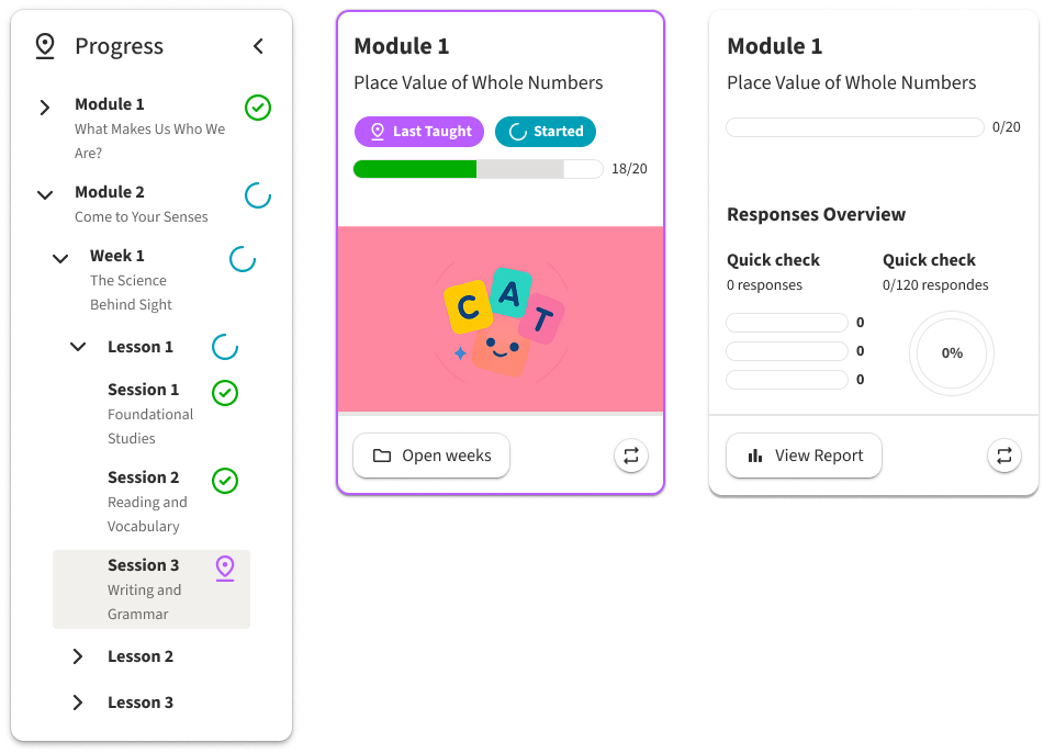
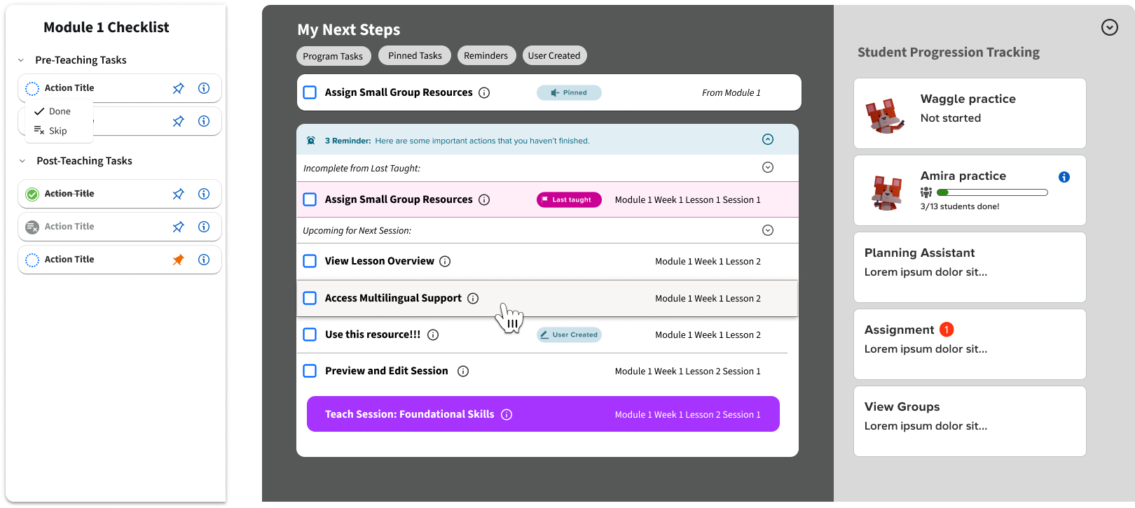
A learning platform is a deep content hiearchy of modules, lessons, sessions and resources all nested inside the next. Getting lost in that complex web of relationships is not a user failure, but a design one. We addressed this with persistent wayfinding woven throughout the experience. Both cards and a collapsible side navigation contained status badges to help teachers quickly identify what was taught last, what was completed, what was started, and what had relevant data available for them. This gave experienced users the confidence to chart their own path without losing their place in the process while providing new teachers a clear visual thread of their teaching journey.
Checklist vs Dynamic List
With the spatial orientation problem solved, we moved onto the core experience issue we identified in Montreal: how to provide both checklist and resource bucket in one cohesive experience. The answer we developed was two layers working from a singular set of variables. Every piece of content was created with an associated checklist of specific tasks tied to it. This gave experienced teachers a quick, scannable reference of what actionable items were attached to each hierarchy of content. They could pick and choose from those actions without prescribing to a rigid sequence.
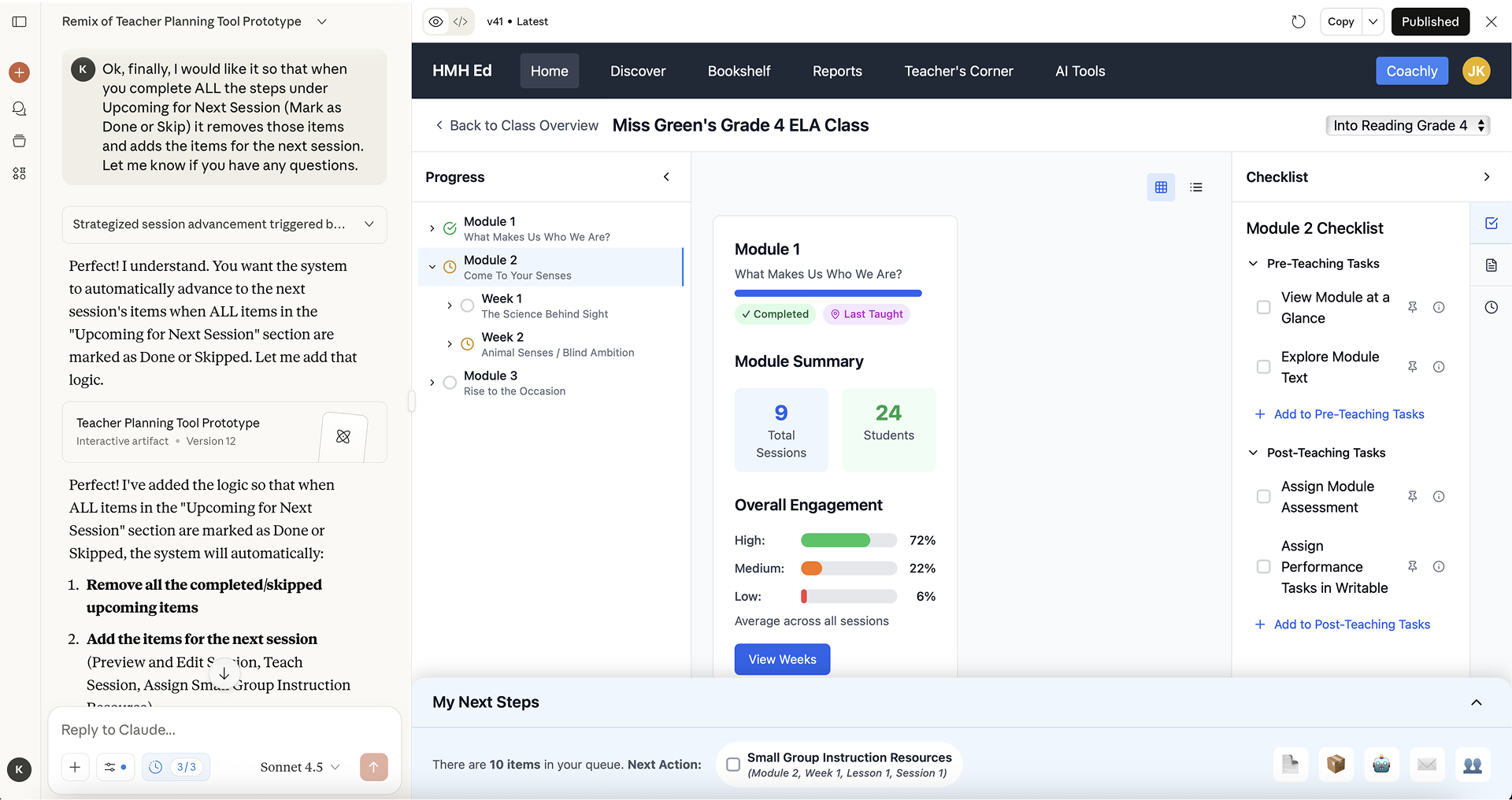
For newer teachers we built an additional scaffold called the Command Center. This was a dynamically populated, sequential task queue that pulled from all of those content-level checklists and organized them into a single, prioritized “what to do next” list of actions. Teachers who wanted to could run their entire week from this view, with tasks that would cross-off and archive as they were completed, and a queue that would reprioritize automatically along with teacher progression. Embedded along with this experience we provided progress tracking widgets that gave teachers real-time insights so they could pivot and modify their path as their live classroom dictated.
AI-Assisted Development
Prototyping this model for user-testing presented a specific-challenge that allowed us to experiment with some new tools, LLMs and generative-AI. The interactions we needed to validate, such as skipping sessions and watching the Command Center queue update in response to user-actions, were too conditional to prototype cleanly and efficiently in Figma. With some iteration on prompting we were able to build a high-fidelity, functional testing artifact that let teachers interact with the real logic of the system. Users could skip sessions and watch downstream tasks update. They could navigate between our card view levels and see how the states tracked their progress throughout. Doing that in Figma alone would have taken far too long to test effectively on our timescale.
The tradeoff was that it worked a bit too well. Several testers initially assumed they were looking at a finished product which caused confusion when some functionality was either not implemented or still a bit rough around the edges. This created a bit of unnecessary noise in the feedback we received, but was a valuable learning lesson as we grow in our use of AI tools in the development cycle.
Feedback and Next Steps
User testing validated the core direction we’d been designing toward since Montreal. Testers found the navigation intuitive and the dual-layer approach addressed a lot of the friction that was driving them toward other tools in the first place. One tester went so far as to call the new approach “visually genius…so appealing, I love how it’s just all right there on one page.” The redesigned Session Organizer is set to hit market for back-to-school 2026 where we’ll have a clearer picture as to just how successful we were.