Repeatable, Familiar, Friendly
For nearly a decade, HMH's digital curriculum ran on a licensed e-book platform, which while functional, was not ours to evolve. When the company committed to becoming a digital-first learning company we knew it was time to rid ourselves of that dependency and develop our own proprietary content delivery system. That effort resulted in Classcraft, a platform built on modular, repeatable lesson patterns that established consistent routines session after session. That consistent experience rippled through our product lines, both print and digital, creating a roadmap for all projects moving forward.
Whole-Class vs. Student-Driven
As we were developing the v2 for Into Math, we discovered that while Classcraft solved the whole-class experience well it didn’t provide any great opportunities for students to break away and work at their own pace. In the classroom, and in particular a math classroom, that kind of self-directed exploration is a core part of how students build understanding, so the fact that it was absent from our guiding product frame was alarming.
As I was leading the Into Math redesign at the time, and because we needed this functionality for our back-to-school launch, my team took on the exploration of this product feature as well, working closley with curriculum specialists and engineers to define what a self-paced instructional object actually needed to do. Three requirements emerged from those conversations and workshops:
- Students needed to be able to move through content independently, at specific gateways, to explore concepts on their own.
- Students needed to have maintained context as they moved between each step of a task, reducing cognitive load.
- Students needed a clear sense of where they were and what they’ve already accomplished within a task, without that progress tracking becoming a source of anxiety.
We named the new tool we were developing after the behavior we were hoping to encourage: Try It Out.
Side-by-Side
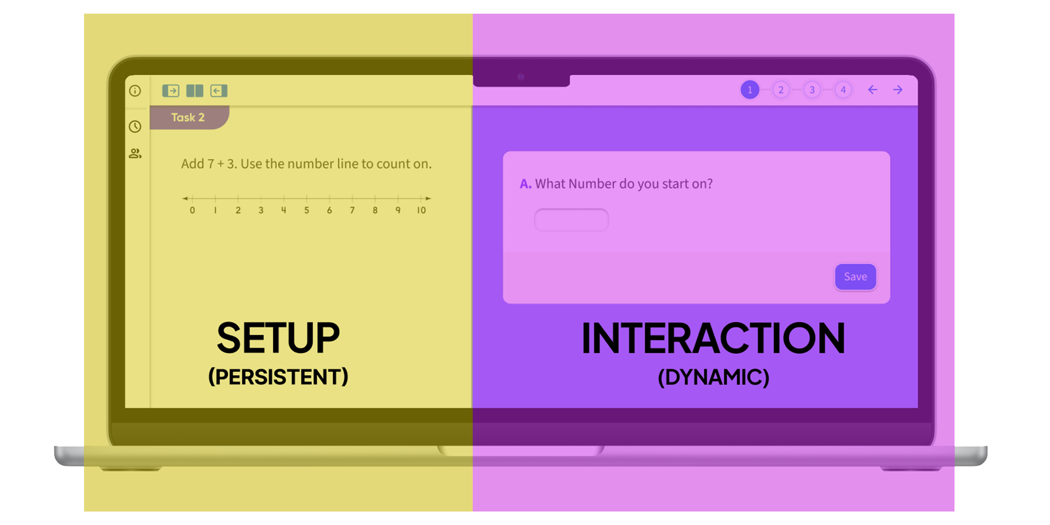
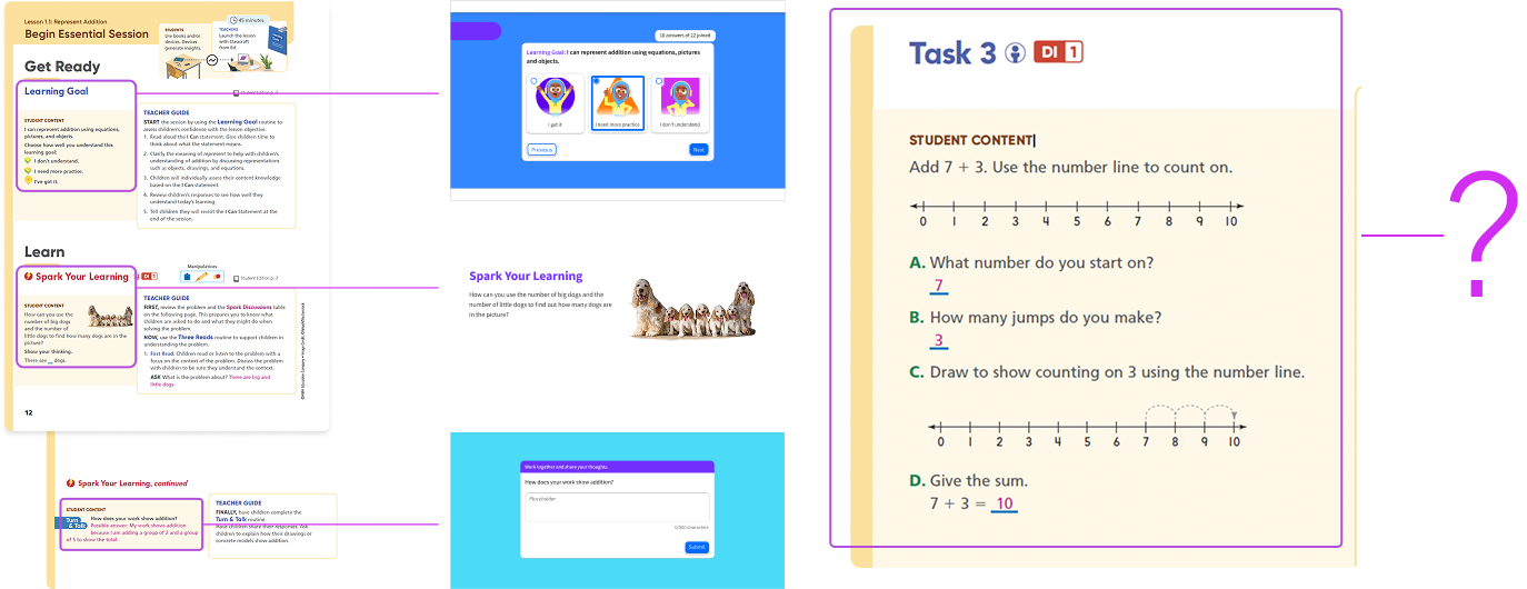
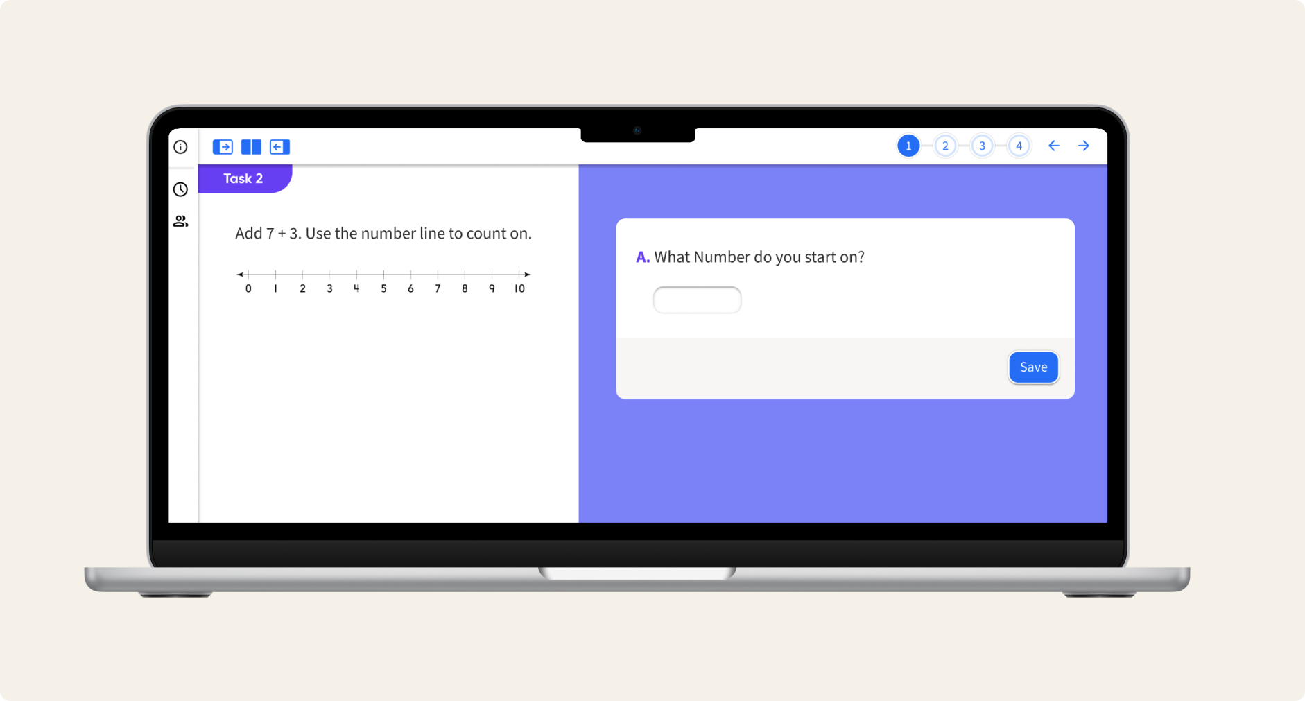
Our first and most consequential layout decision was the split-panel approach: persistent instructional content and stimulus on the left, while stepped tasks and dynamic interactions appeared on the right. This maintained that crucial contextual piece we identified earlier, anchoring the students in the main idea as they moved through the individual task steps. Conventional linear layouts would bury that context as you navigate forward.
Zoom-In/Zoom-Out
This layout decision however introduced a tradeoff that we needed to address: by maintaining a split panel, neither screen had the luxury of a full-screen view. For some interactions that was fine, but often there might be a crucial visual on the left side that could use the benefit of larger screen space. Or students might be tasked with drawing a complex diagram on the right that needed more room than a tiny box would allow. We solved this with an expandable focus mode. Either panel could be brought to full width at a click of a button and just as easily collapsed back in again. It’s a small interaction but it meant that the layout could flex to serve a whole-class moment or an individual student moment with equal fidelity.

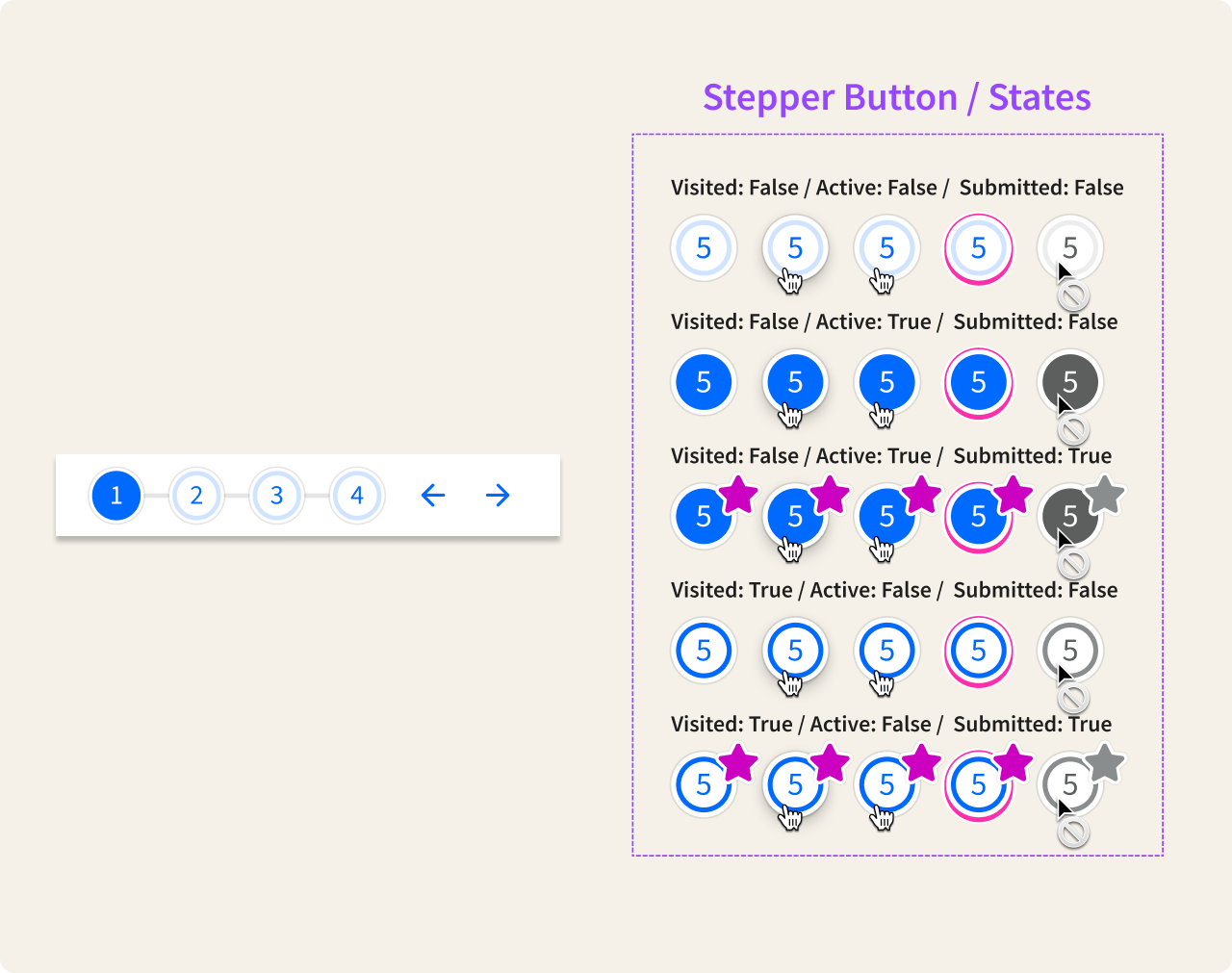
Step-It-Out
Finally, with some activities running to ten or more sequential steps, students needed a clear understanding of where they were in the task – what was ahead, what was already done – without turning that awareness into pressure to perform. We built a stepper component with a carefully considered state system that introduced some very subtle gamification elements. Nothing too over the top as we wanted progress to feel like momentum, not a value judgment. Completing a step needed to feel satisfying but skipping one needed to feel like a valid choice as well, not a failure.
Feedback and Next Steps
Try It Out launched on schedule, along with the Into Math update, two significant products that combined to make a very compelling sales pitch. The feature was well received by both teachers who had been asking for this kind of flexibility in our products and with students who took to the self-paced format quickly. As a nice knock-on effect, what started as a math-specific solution quickly became the company’s go-to model for self-paced learning across product lines. Other teams have since adopted the pattern, iterated on it, and expanded the interaction model we established.